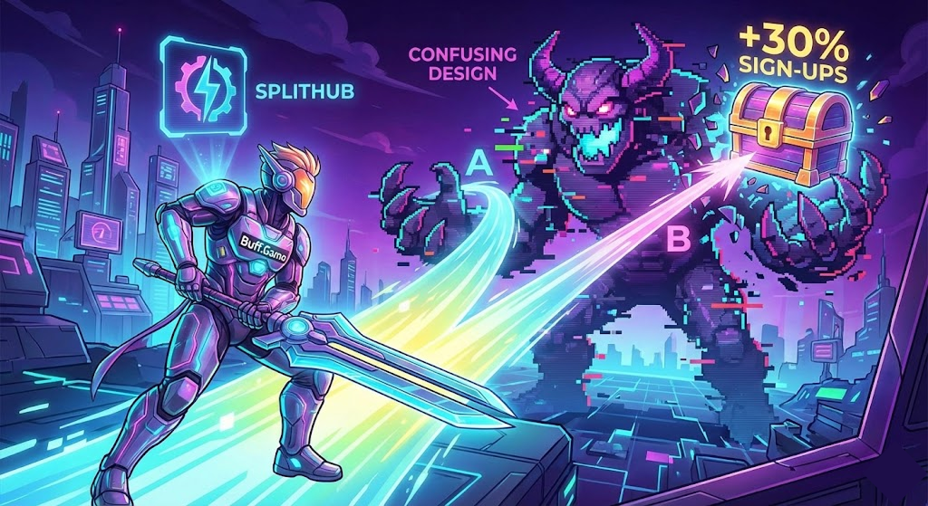
Ever felt that small changes can lead to big wins? We certainly did – and we proved it. At Buff.Game, we’re all about leveling up. Recently, we made a few tweaks to our website that had massive results. How? By using something called A/B testing – basically, running 4 versions of a page to see which one players like better. Instead of guessing what works, we let real data decide. The outcome? 30% more sign-ups and a better experience for everyone. 🎉 In this post, we’ll give you a behind-the-scenes look at how we did it, why we chose an awesome tool called SplitHub to help, and what we learned along the way.
The Challenge: Turning Visitors into Buffs
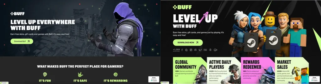
Buff.Game is a platform that rewards gamers for playing their favorite titles. We get tons of new visitors every day from ads and referrals. But here’s the catch: not all visitors become Buff members. Our marketing team noticed we were getting a lot of traffic to our landing page, but not enough people were signing up to join the fun. 🤔 We had a loot chest of ideas – maybe the headline wasn’t clear, maybe the “Join Now” button was hard to find, maybe the page was too busy – but we weren’t sure which idea would truly boost our conversion rate.
We needed a way to test our ideas scientifically rather than relying on gut feeling. Changing things blindly on a hunch felt like rolling the dice in the dark. That’s when we decided to give A/B testing a shot, so we could compare different versions of our page and see, with real numbers, which one players liked more. It was time to remove the guesswork and let data call the shots.
Why A/B Testing?
Imagine you’re playing a strategy game and you have two tactics to beat a boss – A/B testing is like trying both tactics with equal chances and seeing which one gets the victory. In web terms, we show Version A of our page to half our visitors and Version B to the other half. Then we watch the stats: which version gets more people to click “Join” or sign up? By the end of the “match,” we know which page is the winner.
The beauty of A/B testing is that it replaces hunches with hard evidence. We love our community, but we know gamers can be unpredictable – what we think is a cool design might not actually be the most effective. A/B testing let us see exactly what our users respond to. No more “I think this might work” – we get to see what does work, backed by numbers. And as it turned out, some small changes led to big wins for Buff.Game.
Why We Chose SplitHub
We needed something easy, effective, and affordable. Enter SplitHub. We discovered SplitHub – an A/B testing platform that promised to handle the heavy lifting without heavy costs. It was like finding a rare tool in the shop that perfectly fits your build. Here’s what convinced us to choose SplitHub over other options:
- Generous Free Tier: SplitHub let us start free with up to 1 million test events. This meant we could run experiments without paying a gold coin upfront. (Many tools cap free plans at tiny sample sizes – not this one!)
- Simple, No-Code Setup: We didn’t need a developer wizard to implement it. SplitHub is built to be marketer-friendly. We just dropped a small script on our site and voila – we had a “control panel” to create and manage tests without coding. This was a huge plus since it saved our devs’ time. In fact, SplitHub prides itself on being easy and quick for launching tests.
- Lightweight and Fast: We were wary of anything that could slow down our site. Thankfully, SplitHub’s script is super light – around 3.3 KB only. That’s tiny! It didn’t bog down our page load at all. Some older testing tools inject heavy scripts that cause flicker or delays, but not this one. Speed remains 🔥.
- Scales Like a Boss: Whether we had 1,000 visitors or 1,000,000, SplitHub could handle it. During our big test, we ended up analyzing over 1 million impressions and SplitHub managed it without breaking a sweat. No crashes, no hiccups – it was stable even under our heaviest traffic. Reliability was key, and SplitHub delivered.
- Fair Pricing After Free: Once we saw the value, upgrading wasn’t scary. SplitHub’s pricing is transparent: after the free million, it was something like $50 per additional million impressions or a flat ~$99/month for unlimited. Compared to those enterprise tools , this felt extremely reasonable. We like saving money as much as we like earning Buff points, so this mattered.
- Privacy & Control: As gamers ourselves, we care about privacy. We liked that SplitHub is privacy-focused – we control what data gets shared and everything stays compliant with regulations. No creepy tracking beyond what’s needed. It’s a small thing, but it gave us peace of mind that we weren’t compromising our users’ trust just to run experiments.
In short, SplitHub hit the sweet spot for us: easy to use, powerful features, and no wallet wipeout. Now, let’s talk about the fun part – how we ran our big experiment and what we tested!
Running the Experiment
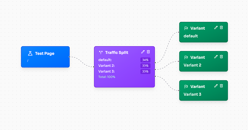
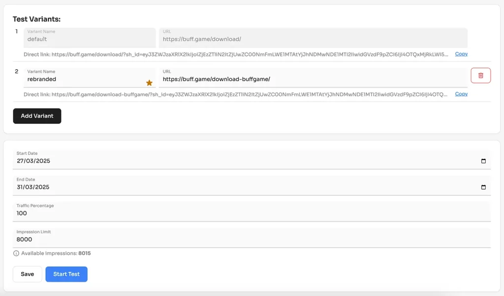
Once we had SplitHub set up, our team went into experiment mode. We created several versions of our landing page – think of them as alternate realities of Buff.Game’s homepage. Each version had something different, based on our brainstormed ideas. We then let SplitHub randomly show these versions to visitors and track what happened. Here’s a rundown of what we tested (our hypotheses):
- Headline Variations: The heading at the top of the page is super important – it’s the first thing new visitors see. We tried one version that was straightforward and clear, and another that was clever/fun but less obvious. We wanted to see if clarity beat creativity.
- CTA Buttons: We experimented with the design and placement of the “Join Buff” signup button. One variant had a big, bold button right at the top of the page, whereas another kept a smaller “join now” link further down. We also played with the text and colors. The question: does a more eye-catching, in-your-face button get more clicks? Absolutely, it does, as we found out.
- Page Layout (Desktop vs Mobile): We know a lot of our users are on PC, but many are on mobile too. So we designed different layouts optimized for each. For desktop, we could afford some more visuals and even a background video in one variant. For mobile, we tested a simpler, scroll-friendly layout with larger text and fewer images. We basically asked: will a tailored mobile page convert better than a one-size-fits-all page? (Spoiler: yes – making a mobile-specific tweak gave us an ~8% lift in sign-ups from phones!)
- Visuals & Media: Humans are visual creatures, gamers even more so. We weren’t sure what kind of visuals would resonate best. We tried one version of the page with an exciting game screenshot front and center, another with a short promo video, and another that was more minimalistic. We also tested adding a trust element – like a quick testimonial from a happy user and images of real rewards. Would these boost trust and interest? We had to test to find out.
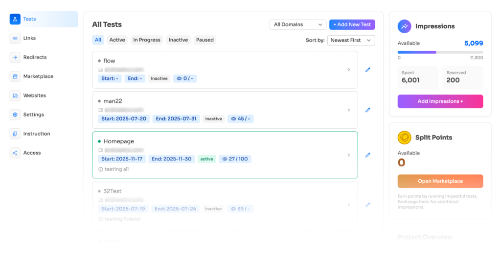
SplitHub made running all these versions at once a breeze. We basically set up these variants in the SplitHub dashboard, and it automatically split the incoming visitors among them, keeping track of every click, sign-up, and interaction. We could watch the results in real-time on a live dashboard – it was a bit addictive, like watching a live match scoreboard. For a bunch of data nerds like us, seeing real user behavior come in live was super exciting. And because SplitHub handled the routing and tracking, we could just sit back and watch the data roll in instead of manually crunching logs or something. It was like having an autopilot for our experiment.
We let the test run long enough to gather lots of data. This way, we were confident that any differences we saw weren’t just random luck, but real, repeatable improvements. Now, drumroll for the results… 🥁
Results: Small Tweaks, Big Wins 🚀
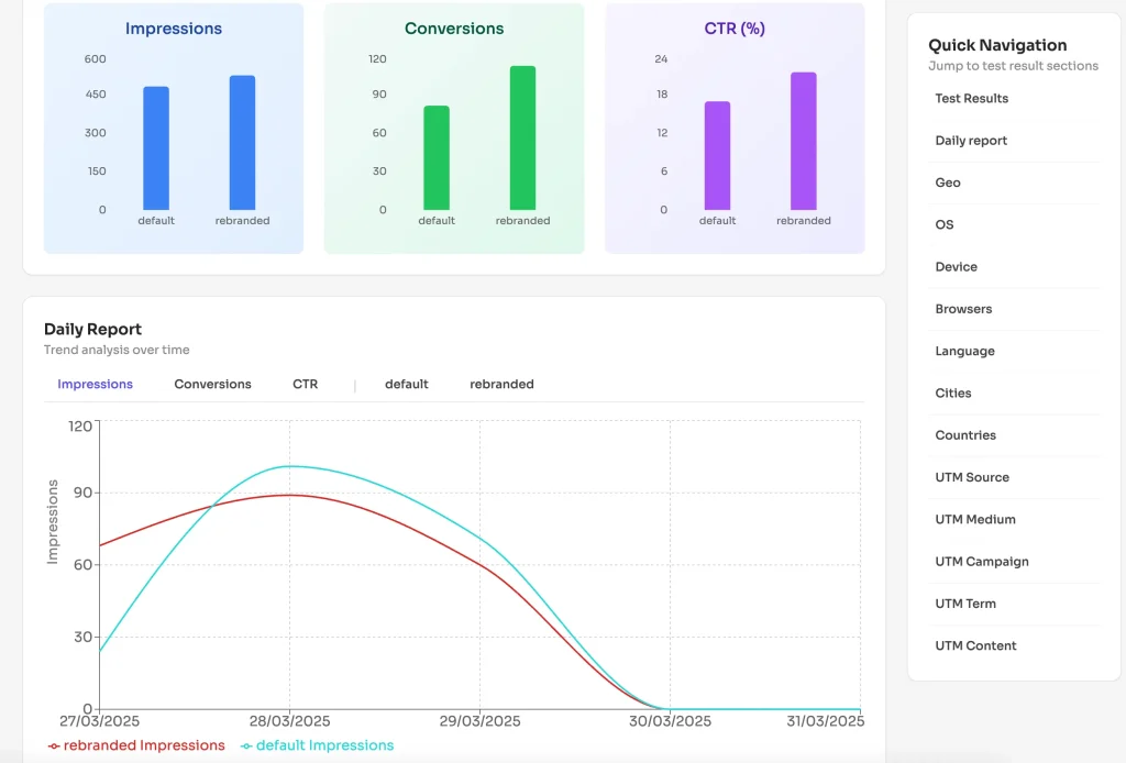
When the dust settled and we looked at the numbers, our team literally cheered. One of the new page variants crushed the original. Here are the data-backed wins that our best version delivered:
- +30% Conversion Rate – In plain English, the winning page got 30% more people to sign up than the original. That’s almost one-third more new Buffs joining our community! This was the stat that made our jaws drop. A 30% boost is huge for any online platform. For us, it meant our gamer community could grow much faster without any extra advertising. 🎉
- +15% User Engagement – The improved page wasn’t just getting more sign-ups; people were also interacting with it more. We saw engagement metrics rise by ~15%. Folks were scrolling further, clicking on more things, and spending a bit more time on the page. This told us the new design/message was more interesting and convincing. An engaged visitor is more likely to become a happy user, so this was great news.
- +20% Ad Spend Efficiency – This one’s a bit technical-sounding but super important: our advertising became 20% more effective. Why? Because if you get more sign-ups from the same number of ad clicks, your cost per acquisition goes down. In our case, after the changes, every dollar we spent on ads brought in 20% more new users than before. 💰 In other words, we could either get more results with the same budget or the same results with less budget. That’s a win-win. It’s like getting extra lives in a game – more outcome for the same input.
These results were beyond our expectations. We knew A/B testing could help, but seeing a 30% jump in conversions blew our minds. It proved that data-driven design works. Instead of arguing in meetings over what homepage layout is best, we let our players vote with their clicks, and we got an answer.
Perhaps even more valuable than the raw numbers, we gained insight into our audience. We learned a ton about what our gamers care about. And those lessons will keep benefiting us beyond just this one test.
Let’s highlight a few key takeaways from this experiment:
- Clear Messaging FTW: Remember that headline test? The version with a straightforward headline clearly resonated. It got about 10% more clicks on the sign-up button than our vaguer, “clever” tagline. The lesson: gamers appreciate clarity. When we instantly tell you what Buff is and what value you get, you’re more likely to stick around. No one likes mystery meat on a menu – same goes for websites.
- Make the Call-to-Action Obvious: We found that having our “Join Now” button big and up top was much better than hiding it below. In fact, the prominent CTA was clicked by roughly 12% more visitors compared to the smaller, lower-placement one. Many people, especially on mobile, don’t scroll a lot. They land on the page and give it a few seconds. If the action button is right there, bright and inviting, they are more likely to tap it. If it’s hidden or dull, we might lose them. So, now we put our main CTA where you can’t miss it.
- Optimize for Mobile Users: This is a big one in gaming since so many gamers access stuff on their phones. Our mobile-specific page variant outperformed the fancy graphics-heavy version – it led to about 8% more conversions on mobile. That told us that mobile users prefer quick, easily digestible info. We’ve since made sure our mobile site stays snappy. Meanwhile, on desktop we have a bit more freedom to add eye-candy like videos, as long as it doesn’t distract from the main message or slow things down.
- Visuals and Trust: Adding visual proof of what Buff is about – like showing examples of rewards you can earn, or quoting a happy user – had a positive effect. One test version that included those saw visitors stay around 20% longer on the page on average. That extra time spent likely means people were intrigued and felt that Buff.Game is legit and worthwhile. While not everyone who lingers will sign up, building trust and interest is never a bad thing. We just have to balance adding cool media with keeping the page fast .
- Continuous Improvement: Perhaps the biggest lesson we learned is to adopt a testing mindset. This one experiment was a huge success, but we’re not stopping here. The gaming world changes fast, and user preferences can evolve. We plan to keep running experiments and never assume we know it all. Today’s winning page might be beat by tomorrow’s creative idea. By treating everything as an ongoing beta, we’ll keep Buff.Game at the top of its game. As we like to say, always be leveling up. 💪
Why SplitHub Was a Game-Changer 🎮🛠️
We’ve raved about SplitHub a bit already, but it deserves a victory lap for how much it helped us. From Buff’s perspective, SplitHub was like that reliable co-op partner who watches your back while you complete the objective. Here’s a quick recap of why we’re glad we picked SplitHub:
- Ease of Use: The interface was super intuitive. We set up multiple page variants and SplitHub did the rest – splitting traffic between them without any custom code needed. In the past, some tools required lots of coding or fiddling. With SplitHub, we literally configured tests in a few clicks. It let us focus on what to test, and it handled how to test, which was perfect for our small team.
- Real-Time Analytics: We could monitor results as they came in. The moment one variant started outperforming another, we saw it on the dashboard. This real-time feedback is super engaging and useful – it’s like seeing match stats live instead of waiting for the end. It also helped us ensure everything was tracking correctly. Some older solutions we used had delays or only gave results after the test ended. We prefer the live data approach now.
- Stability and Performance: No lag, no crashes, no interference with our site. That 3.3KB script is no joke – it’s so small that it didn’t slow down our page at all, even for users with slower internet. And even with over a million impressions flowing through, SplitHub handled it like a champ. We’ve heard horror stories of certain A/B testing tools causing page flicker or downtime. We experienced none of that. It was as if SplitHub wasn’t even there – except for the fact that we were getting awesome data on the back end.
- Cost-Effective: After the experiment, we were basically sold on making A/B testing a regular part of our toolkit. SplitHub’s pricing made it a no-brainer to continue. The free tier covered our initial run, and upgrading didn’t require CFO approval or selling a kidney. 😅 In contrast, some big platforms we peeked at would have cost us tens of thousands yearly – which, frankly, would have been a deal-breaker. We feel SplitHub offers fair pricing for the value it provides. It’s always nice when a tool helps you earn more than it costs!
- Community & Support: Being a relatively new platform, SplitHub’s team was very responsive to our questions. We even discovered it through a case study that they did about Buff. It’s cool using a tool where the creators are enthusiastic and quick to help if you need it. It feels like we’re not just using software, but kind of “partnered” in improving Buff. That positive experience matters, especially after dealing with some giant companies’ support where you’re ticket #75829 in the queue.
To sum it up, SplitHub was the right choice for us and it played a big role in our 30% conversion boost success. 🎯 If you’re a fellow gaming industry friend or just curious, we’d recommend giving it a look if you ever need to do optimization. It turned the intimidating task of A/B testing into something straightforward and even fun.
Conclusion: The Grind Continues
We’re thrilled with the results – who wouldn’t be excited about more gamers joining Buff and enjoying what we offer? But we also know we can’t rest on our laurels. The gaming world evolves, and so do player expectations. What worked today might be outdone by a new idea tomorrow. That’s why we’re embracing a culture of continuous experimentation. We’ll keep listening to you, our community, and keep testing tweaks and improvements. Maybe it’s a new feature in the app, a new layout for the marketplace, or an improvement in the Buff onboarding flow – the philosophy remains: test it, get the data, and make the call.
For our fellow gamers reading this, you might be thinking, “This is cool and all, but how does it affect me?” Well, because of this effort, you likely noticed our website got a lot smoother and clearer recently. That’s all to make it easier for new friends to join us and for our community to grow. A growing Buff community means more matches, more content, and more fun features down the line. It’s a win for everyone.
Also, we hope sharing this gave you a fun peek under the hood at how a gaming company like ours makes decisions. We treat it a bit like gameplay – try something, see how the “players” react, and keep iterating to make it more enjoyable. In a way, Buff itself is a game that we’re constantly updating and patching to make better!
Lastly, a bit of inspiration: if you’re working on something – whether it’s a gaming blog, a YouTube channel, or maybe your own indie game – don’t be afraid to experiment and use data to guide you. We started off not knowing much about A/B testing, but tools like SplitHub and the success of this experiment showed us that anyone can do it and benefit. You don’t need to be a huge company or a coding genius to start testing ideas and improving. As we saw, even a headline change can make a difference.
GG to everyone involved in this project, and thank you to our community for being part of the Buff journey. We’ll keep leveling up Buff.Game for you – one test, one patch, one update at a time. 🚀
Happy gaming, and see you on Buff! 🎮